5 minutes
Creating an Instagram “Like” Animation With StateListAnimators
Creating a stateful button is a very common use-case that you might come across in your application. A stateful button, operates very much like a toggle to depict binary values. For example : a post is liked or not liked, user is followed/not followed, article is bookmarked or not etc.

Android provides a very easy way to emulate a checked behavior which does away with a lot of code that might be required to change the icons or the color of the icons when the button is clicked.
StateListDrawable
In Android, the definition of a Drawable is very flexible. Drawable can encompass bitmaps, colors as well as other drawables themselves.
StateListDrawable is an amazing tool provided by Android (extends Drawable) which lets us define multiple drawables that will be swapped out by Android depending of the state of the element.
StateListDrawable defines predefined “states” that elements can be in. The most common ones are state_checked, state_pressed, state_enabled, state_focused etc.
Not only can you define drawables so that the icon changes with state change, you can also define borders, fill color, border color etc for each state. This way, a simple element like a Button can have a different look from when it’s disabled to when it’s pressed.
Enough talk, let’s get to the code
Here we have an XML file which emulates a poor man’s Instagram feed post.
The main thing we’re concerned with is :
<CheckBox
    android:id="@+id/likeIcon"
+   android:button="@null"
+   android:checked="false"
+   android:background="@drawable/like_icon"
/>
I’m representing my like button as a CheckBox. Why? More on that in some time.
The android:button="@null" means that there is no button associated with my CheckBox. The android:checked="false" is to keep it unchecked by default.
Our main property is the android:background="@drawable/like_icon" where the like_icon.xml is our StateListDrawable. Let’s take a look at that!
It’s pretty small and compact. We’re defining a <selector> which contains all the states for which we want to define custom drawables/properties.
<item android:state_checked="true" android:drawable="@drawable/ic_thumb_up_red_24dp"/> defines the Drawable for the checked state.
<item android:drawable="@drawable/ic_thumb_up_black_24dp"/> defines the default drawable to show.
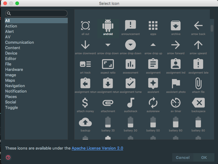
The icon can be found in Android Studio itself. You can get them by going to File -> New -> Vector Asset and click on the Droid icon which will pull up a list of icons.
So, coming back to CheckBox. Why CheckBox and not ImageView or ImageButton or even a Button. The answer is the Checkable interface defined by Android which gives an element “checkable” abilities. Only CheckBox,CheckedTextView,CompoundButton,RadioButton,Switch,ToggleButton implement Checkable. Hence, our best bet is to use these elements and replace it with our own backgrounds. However, if you want more control over the toggle abilities then you can easily extend, a Button for example and implement Checkable.
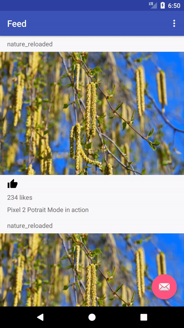
After doing this, the toggling looks something like this :
Looks cool, but it will look cooler if there’s an animation associated with it. Because let’s face it, everything is cooler with animation.
Animating a state change is actually a joy. My experience with animations on Android has always been frustrating but with element states, Android has yet another wonderful tool called StateListAnimator
StateListAnimator
It works very similarly to a StateListDrawable. In a <selector> you can define different animations for different state of the element. Since we’re trying to emulate Instagram, we’re gonna try and implement something that first increases in size and then goes back to it’s original size, as can be seen in the GIF at the beginning of the article.
Our likeButton element now has an extra property:
<CheckBox
    android:id="@+id/likeIcon"
    android:button="@null"
    android:checked="false"
    android:background="@drawable/like_icon"
+   android:stateListAnimator="@animator/scale"/>
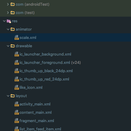
To add an animator, we’ll have to add an animator folder in our resources. You can then create a file called scale.xml and your file explorer will look something like this :
Let’s take a look at the animator.
It looks really big, but it’s pretty simple. The animator for both checked and unchecked state is the same, because Instagram does the animation both for liking and not liking the post.
<objectAnimator
     android:duration="@android:integer/config_shortAnimTime"
     android:propertyName="scaleX"
     android:valueTo="1.525"
     android:valueType="floatType" />

<objectAnimator
     android:duration="@android:integer/config_shortAnimTime"
     android:propertyName="scaleY"
     android:valueTo="1.525"
     android:valueType="floatType" />

<objectAnimator
     android:duration="@android:integer/config_shortAnimTime"
     android:propertyName="translationZ"
     android:valueTo="4dp"
     android:valueType="floatType" />
We define three object animators : One to increase the X value from 1 to 1.525, one to increase Y to 1.525 and one to increase the height to 4dp. We also have provided a duration from Android’s default. These three will take care of scaling the image from 1 to 1.525. Now we will define three animators to scale the image back to it’s original size.
<objectAnimator
      android:duration="@android:integer/config_shortAnimTime"
      android:propertyName="scaleX"
      android:valueTo="1.0"
+     android:startOffset="@android:integer/config_shortAnimTime"**
      android:valueType="floatType" />

<objectAnimator
      android:duration="@android:integer/config_shortAnimTime"
      android:propertyName="scaleY"
+     android:startOffset="@android:integer/config_shortAnimTime"**
      android:valueTo="1.0"
      android:valueType="floatType" />

<objectAnimator
      android:duration="@android:integer/config_shortAnimTime"
      android:propertyName="translationZ"
+     android:startOffset="@android:integer/config_shortAnimTime"**
      android:valueTo="0dp"
      android:valueType="floatType" />
Again, pretty trivial stuff. We scale the objects X, Y and Z to 1.0. The interesting property is the android:startOffset and we add that because we don’t want to start this animation till the scaling animation is over.
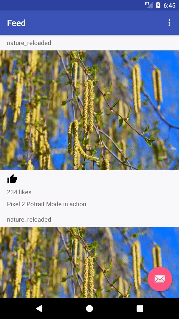
Once we do that, our app now looks like this!
It’s pretty cool and we’re very close to Instagram’s animation (Except of course the ugly UI and the like icon :P ). The only thing it might differ on is the duration which can be tweaked around.
Using StateListAnimators, we can animate all kinds of stuff including state_pressed, state_disabled etc.
Happy coding!